Luko
Refresh identity
Brief
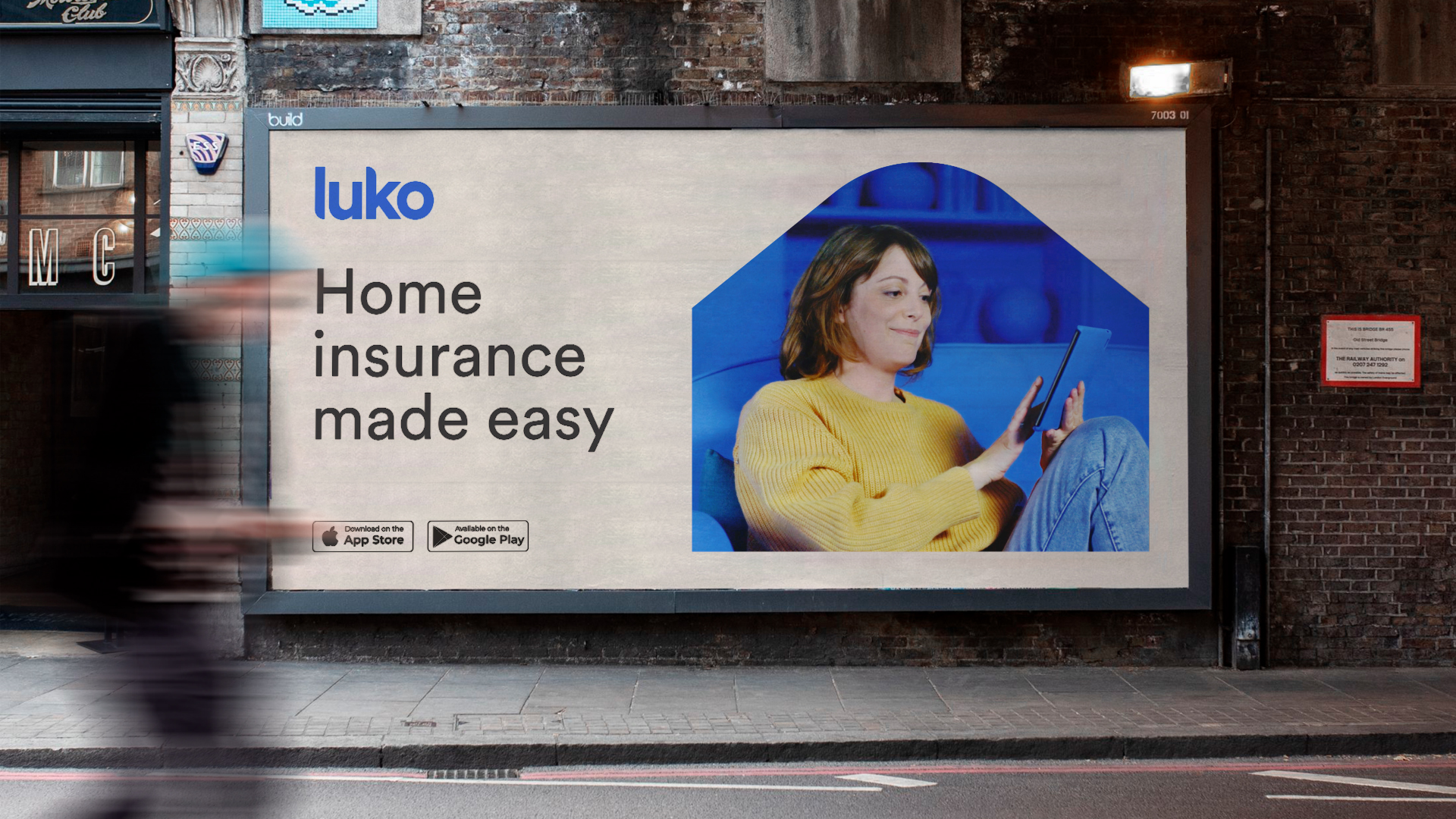
No. 1 in neo-insurance in Europe, Luko no longer wants to position itself as a small start-up and is taking a more statutory and serious stance. The challenge was to refresh the identity while keeping the historical logo.
Soluion
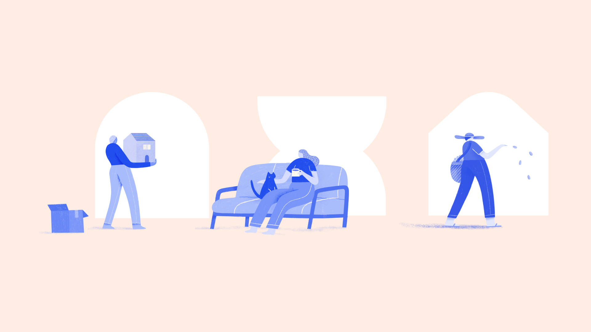
Based on the historical shape of the logo, a simple and agile graphic system is defined that reflects the shape of the house: Door, window, curtain, picture frame, comfort object... This system is warm and interactive, it gives more breath to the brand to make it more readable and clear in its message.
In this way we speak from the inside out,
it marks the territory of HomeCare.